Game Jam Retrospective!
Hello!
This update is a small look into the module's design process and some reflection on the overall ranking in the Knave 2e Adventure Game Jam! The main thing to note is...My handwriting is atrocious.
Initial Design
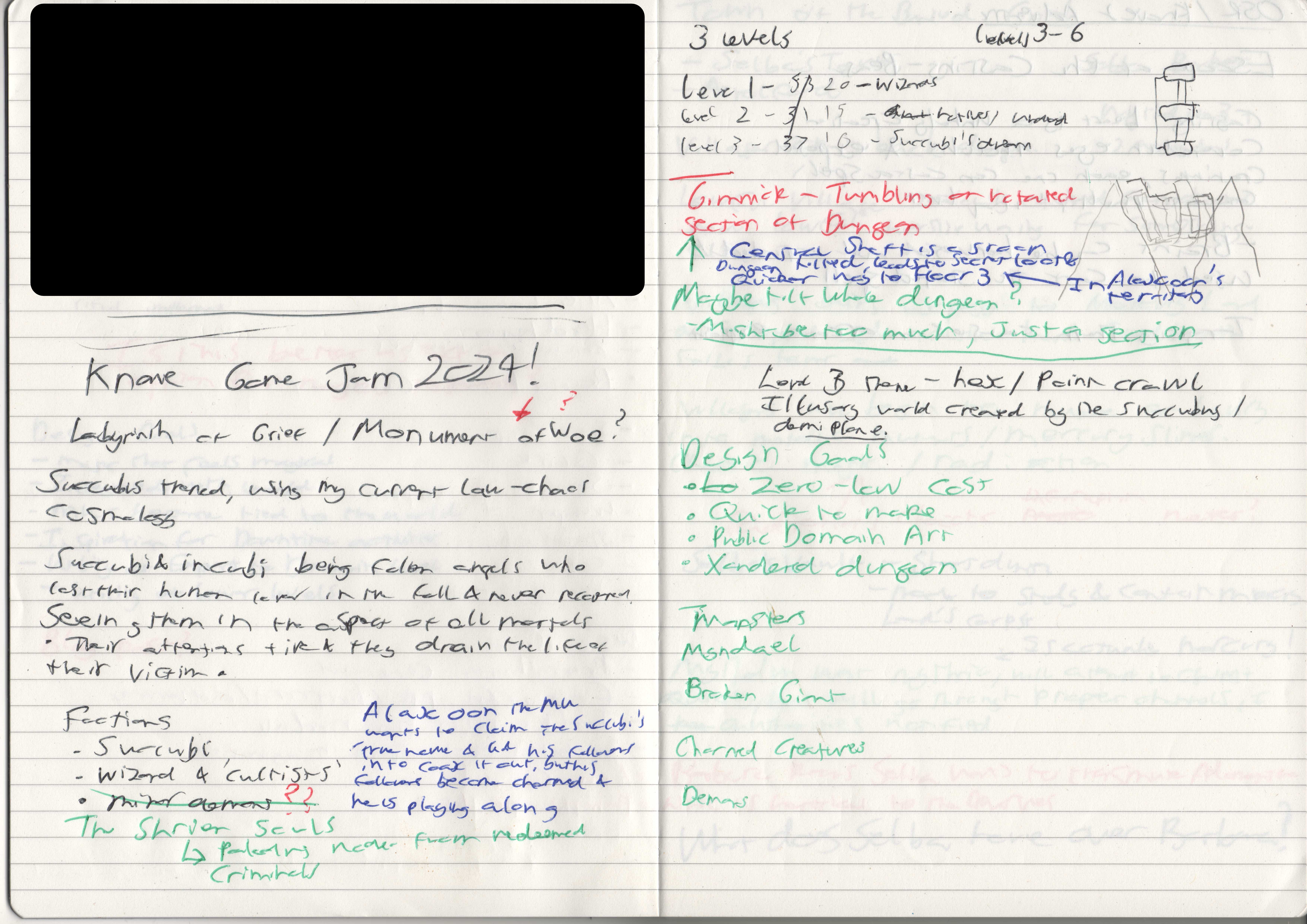
Design started out looking at the judging criteria and trying to think of ways to make something that would score well on all fronts. I began with some notes in a notebook to flesh out the main ideas; I had been considering the subject of fiends and demons within the context of my games anyway, so I thought to use the adventure to flesh them out and get them across (hopefully) organically without using heaps of text.
The vast majority of the initial ideas ended up in the module itself, with a few exceptions:
- The third faction was removed
- The Dungeon was almost completely sideways.
- The third floor was going to be normal until it wasn’t.
Alaxoon and Ph’aarna were always in consideration, but originally I was going to have a third faction- one for each floor. This was originally going to be subordinates of Ph’aarna who were displeased with her inaction and general wallowing. I then changed this for a different one, the Shriven Souls, an order of Paladins made of former criminals devoted to redemption and restitution, who have taken it upon themselves to offer salvation to demons.
I liked this idea, enough that I think it deserves fleshing out a bit more, so they were dropped. The concept of restitution for demons is an interesting idea tossed around in some more niche heresies. As my main meta-setting considers spiritual beings like demons differently, I feel this requires a bit more exploration than the jam format allows.
Originally the whole dungeon was going to be tilted.
I wanted to lean into the originality aspect of the writing criteria, but I wasn’t sure I wanted to subject parties to a very likely death trap for the unprepared. I still feel like this will be a fun idea to play around with and a small bit of this survives in the Collided Fragment. It definitely needs some refinement before I release anything larger based on this idea.
I considered having all three floors be a traditional dungeon crawl, but prior to mapping it out, I realised that my initial projection would be way too big for the page limit, so is settled for a point crawl. My biggest concern was page count: I wanted to do a full dungeon since I think the dungeon crawl is a fairly quintessential OSR experience, but I also wanted it to be big enough to benefit more clearly from having different factions. I think I got there in the end on that front.
Maps
From this point, I began to map the dungeon. The idea was based on visual depictions of ziggurats and the tower of Babel, so I wanted a tiered structure the original maps look as follows:
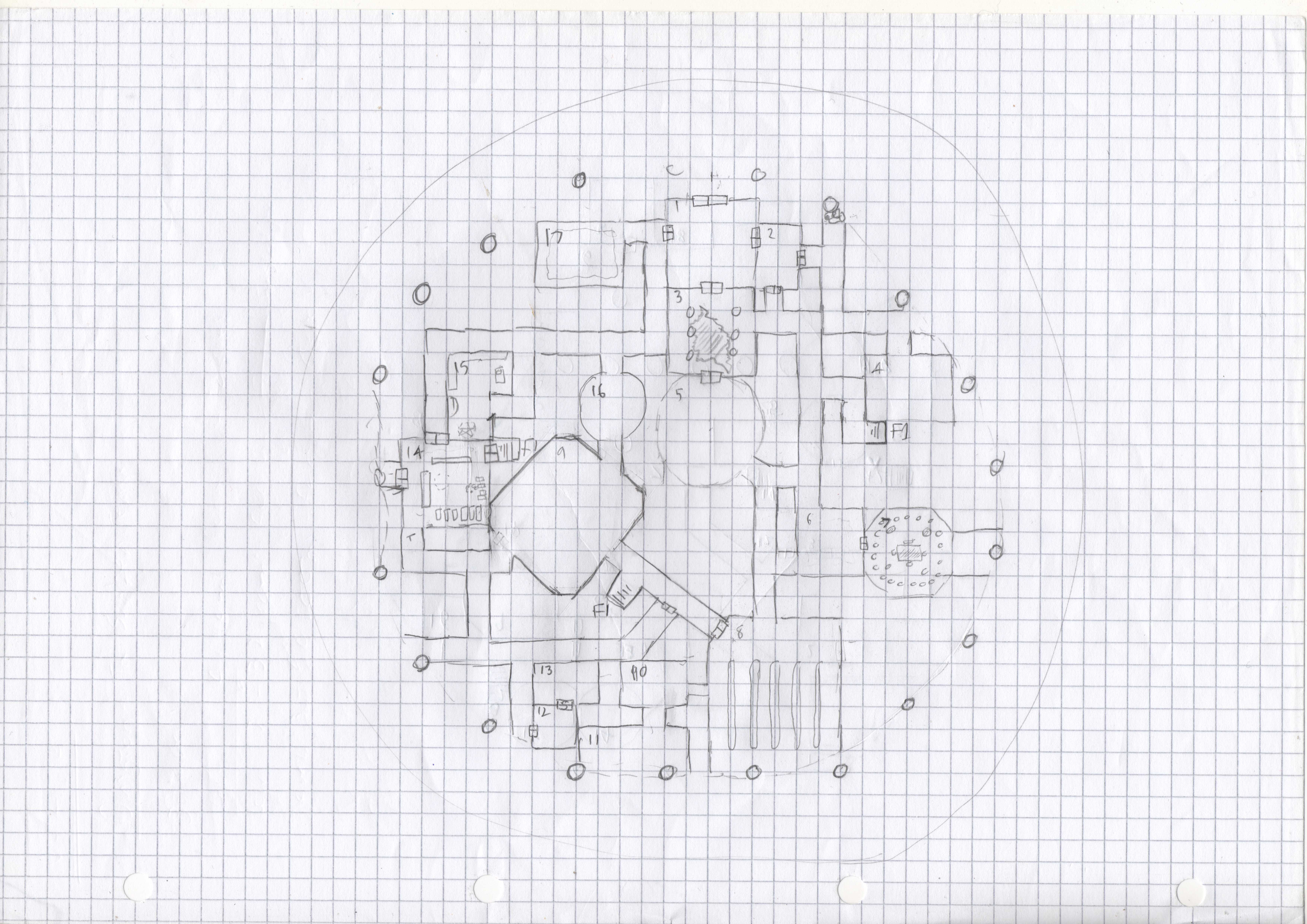
The first thing you might notice is that the F1 has a big circle around it. This is a (poorly drawn) pedimented ring that encircles the structure. The lines determining this were cut due to space but the idea is that you can enter the ruins from any of the side passages or chambers. Originally this was going to tie into the ‘sideways ruins’ theme, with parties able to traverse the exterior of the ruins to skip sections of the dungeon if they were willing to contend with predators, blizzards, high winds and treacherous footing.
Although removed, the intention is still that parties could skip chunks of the dungeon by scaling the exterior, though I don’t think that is super clear in the final cut. It was mostly removed due to formatting of the maps and tables (I would consider adding the pediment back in some form though in the future).
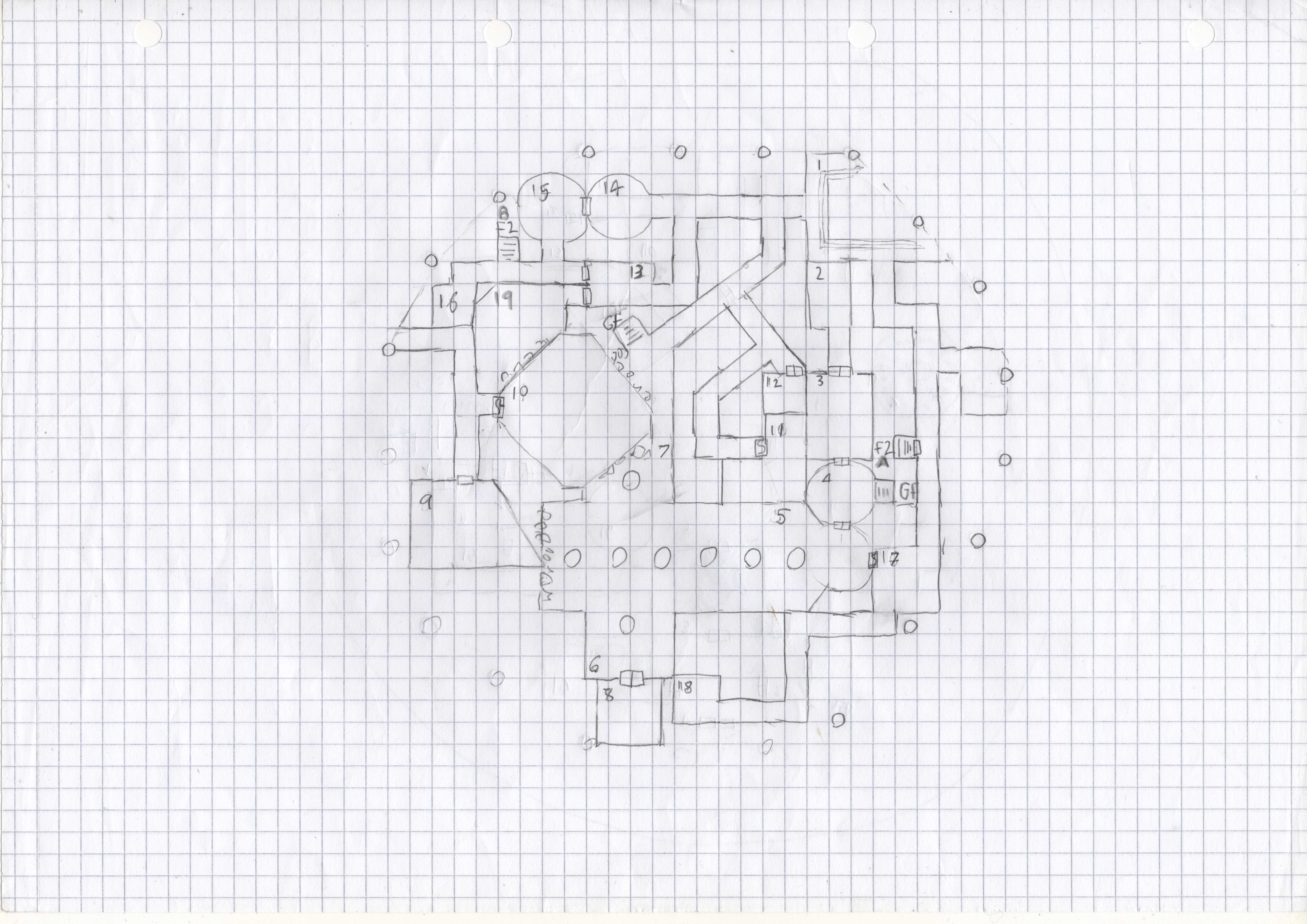
On Floor 2, the main thing to notice is there is actually a lost room! (try playing spot to difference on the right-hand side) I forgot to key it. XD You can probably spot (if you look closely) signs of my hasty job of editing the published map with poor Krita editing skills…
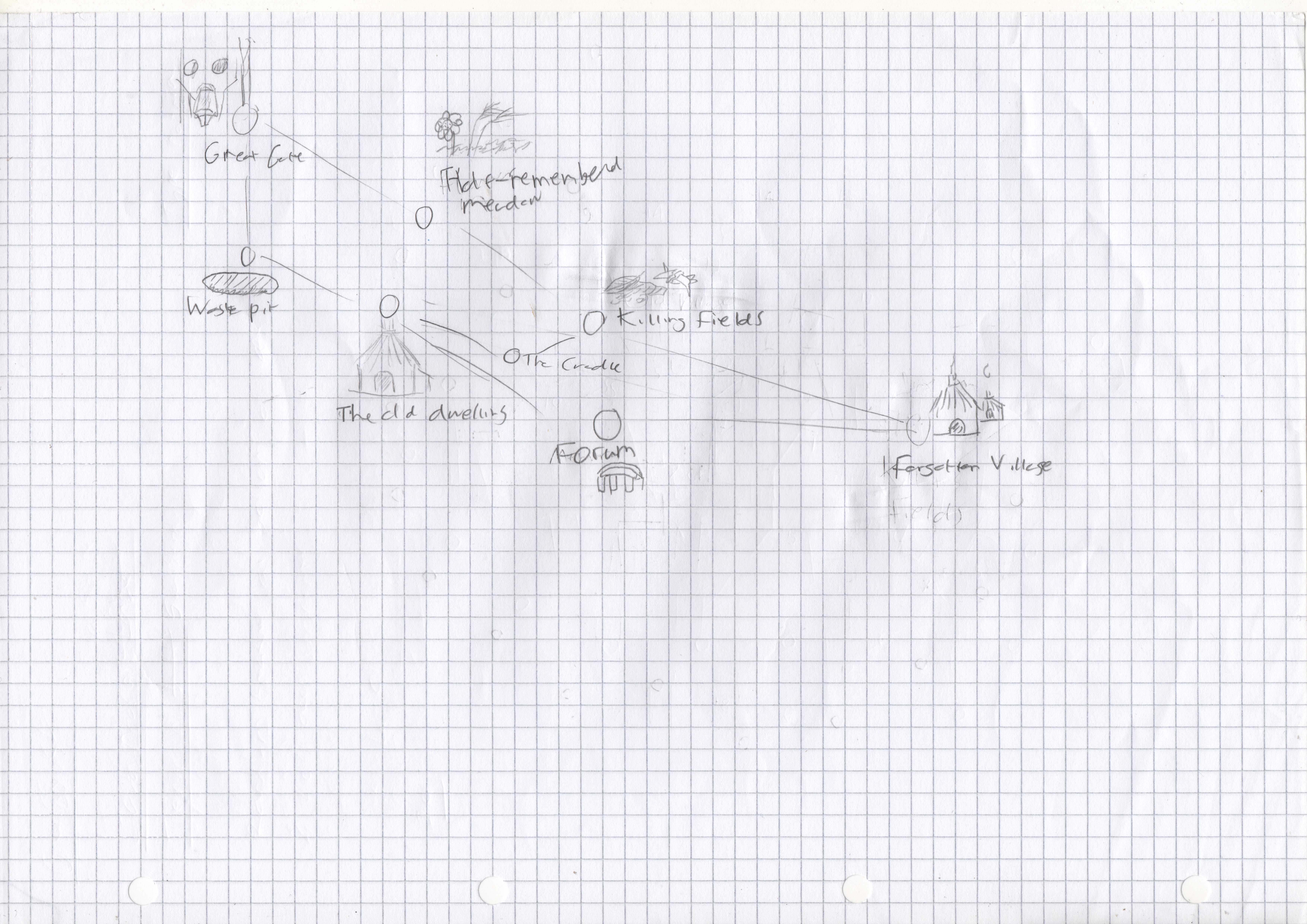
The biggest change from the initial design though is floor 3, I had settled for point crawl, but realised after drawing it that it was too big and that I’m not too well versed in point crawl methodology, so it was likely to be a bit lacklustre. I scaled it back to the only locations I knew I needed – the old dwelling and the waste pit- then added a third one. I chose the killing fields mostly because I thought having a more wilderness exploration encounter in a dungeon would be a fun little twist, but also hint at the wider history of the location.
Cover
Now a quick look at the cover! Originally I had a fun cover design in mind, but I quickly realised I wouldn’t be able to produce it to a level I was happy with (I’m a bit picky with my drawings, I only recently started drawing regularly again) So I decided to go with a more minimalist approach using some public domain artwork. If I ever did a remaster of MoW, I’d probably commission some artwork based on my original concept.
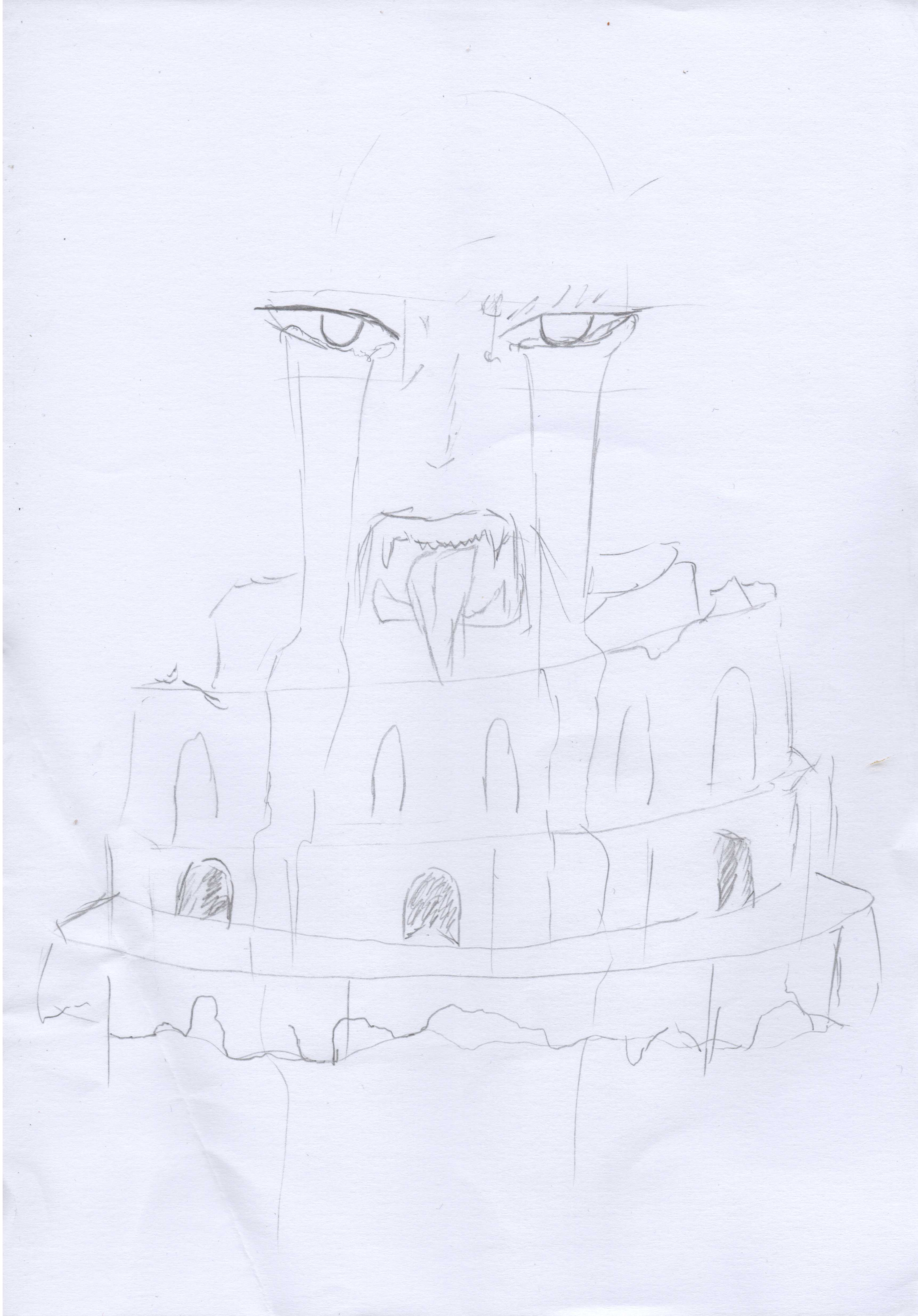
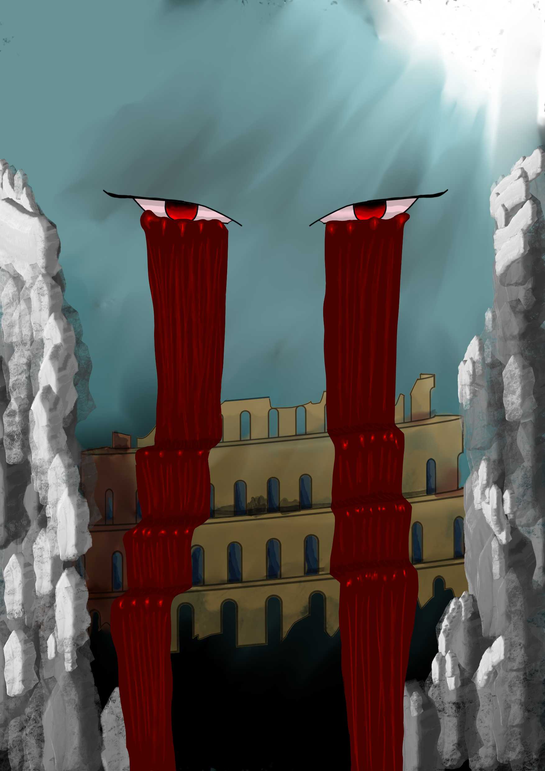
Colour choice
So you’ll notice I went with a tan and slightly purple-black tone for the page and text. I quite like the colours overall, I feel it helps give a slightly old-school look that is slightly less harsh than black and white. The reason for this is a bit stupid, to be honest...
I committed the cardinal sin of doing work in image editing software while I had my red-light filter on.
Yeah.
I had gotten my main image for the cover and used the selector to pick colours that matched the lineart and background colours from the image itself so that everything else matched it as closely as it could to keep it consistent; I was happy with the colours, then next day realised it was a lot paler than I remembered… I had to approximate it, but I think I got it pretty close in the end!
Lessons Learned
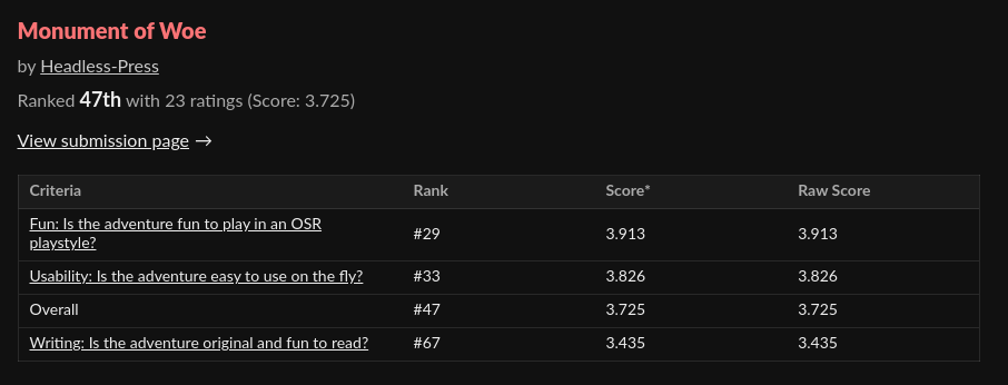
Overall I feel I exceeded my expectations performance-wise, I’m quite pleased with the overall performance. I aimed to make it usable and leaned into the things about dungeon-crawling that make the OSR unique. From a writing standpoint, I feel as though I did a good job, based on how unique a lot of the winning adventures were, MoW is a fairly standard dungeon (albeit with some interesting concepts and characters, if I do say so myself ;) ) so I can see why it doesn’t rate as high on the Jam’s writing criteria. I had to clip the prose pretty heavily to the bare essentials to fit the dungeon in. It was never that word-heavy though, since I wanted to emulate the more lightweight style of a lot of OSR content out there.
For downloads, MoW passed the 200 mark just before the weekend (Woo!) putting it reasonably high on the Jam’s popular filter, which is a bit surreal, to be honest. As long as people enjoy and use the module that’s the only real metric I feel matters! :D
Anyway, that was a bit rambly but hopefully you found it interesting! Future updates will likely be simple error fixes, but I’ll also notify you all of my next project when it releases! It is a bit different to MoW, but it has been in the works for a while before the Jam derailed me a bit, it should be out at some point before the new year.
I shall see you then!
Gabriel
Get Monument of Woe
Monument of Woe
Can you claim the treasure at the ruin's heart? Or will your own heart be claimed in turn?
| Status | Released |
| Category | Physical game |
| Author | Headless-Press |
| Tags | Dungeon Crawler, knave2e, OSR, Tabletop role-playing game |
More posts
- My Second project, The Basilisk, is out now!76 days ago
- Minor Error fix!Oct 17, 2024
- Small Update - typos and small errorsOct 13, 2024
- Map Handouts added!Oct 10, 2024
- So...What comes next?Oct 09, 2024
Leave a comment
Log in with itch.io to leave a comment.